
Software Advice
Based in Austin, Texas, Software Advice (a Gartner company) is a leading technology authority that guides buyers through a vast landscape of software research and expert consultations. Condorita Design led a seven-month visual transformation to align the brand’s digital presence with its position as a global research leader. By bridging high-level strategic intent with production-ready execution, we established a unified design system and a flagship content hub—transforming the organization’s reach from tactical outreach to a sophisticated, content-led authority.
Client Gartner, Inc. / Software Advice
Location Austin, Texas
Sector, industry Technology, B2B SaaS, Research & Advisory
Scope Strategic Design Direction, Content Hub Development, Brand Systems, Digital Assets
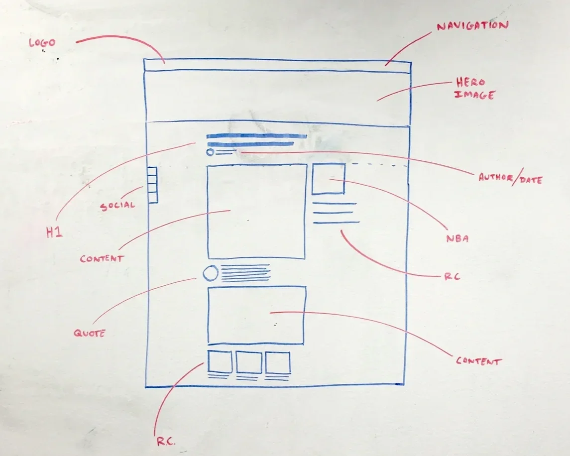
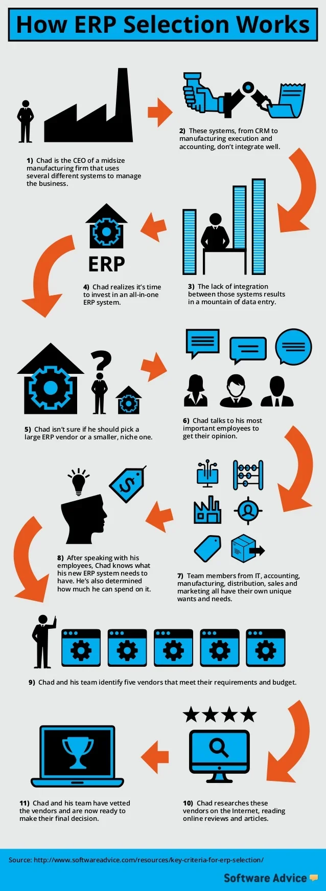
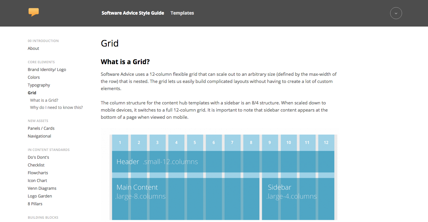
Anatomy of a Content Hub
Executing a vision of this scale required a seamless blend of strategic collaboration and technical precision. Working in tandem with leadership and UX partners, Condorita Design directed the entire visual ecosystem—from the foundational wireframes to the final interactive states—ensuring a fluid, responsive experience across all platforms.
We engineered a modular grid system within a WordPress framework to serve as a steady anchor for the brand’s vast research library. By establishing strict visual parameters and character-controlled typography, we maintained an elegant, unbroken interface across every device. Beyond the aesthetic, we refined the navigational architecture—optimizing filters
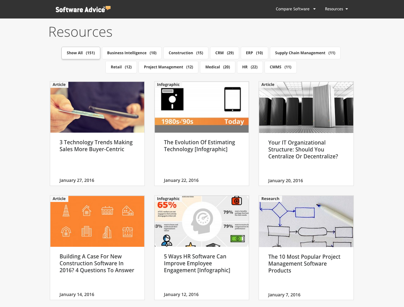
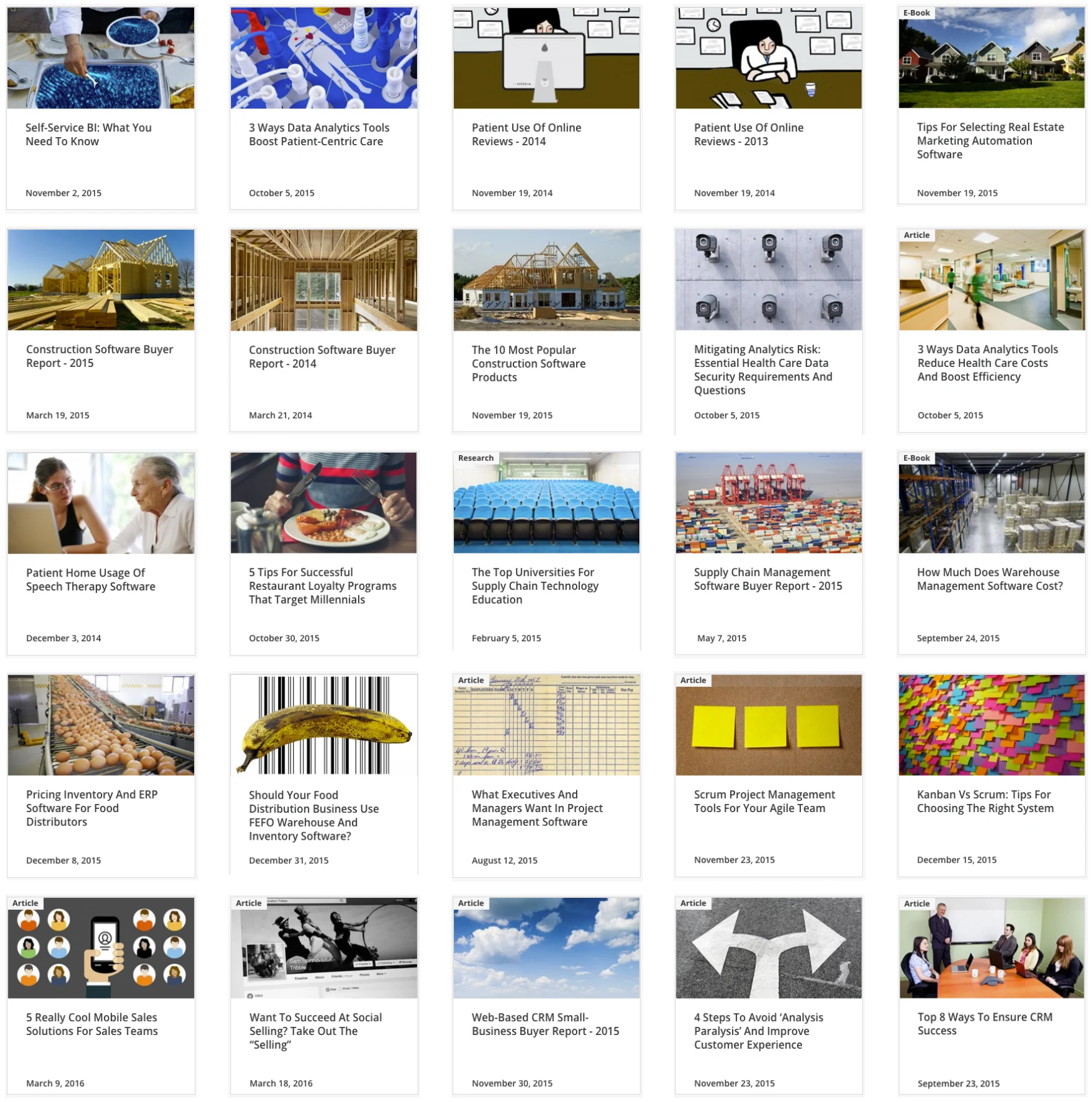
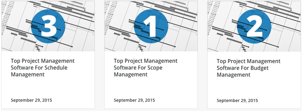
Landing Pages
A Unified Visual Language
To invite users deeper into the brand’s story, we crafted a soulful and consistent art direction that speaks with a singular, authoritative voice. Drawing on deep academic research and aesthetic theory, we established a visual ecosystem where every image serves as a guidepost for the user.
By curated a diverse yet disciplined library of photography, custom illustration, and iconography, we ensured that the brand’s message remains resonant across all mediums. This strategic art direction was designed with both beauty and scalability in mind—providing a high-altitude aesthetic that supports a rapid publishing workflow without losing its human touch. Whether created directly or guided through our creative oversight, every asset ensures the brand’s vision remains clear and elevated.
In certain instances the landing page tiles needed to function for multi section content (example below). When these situations arrived, a global system was created and added to the style guide.
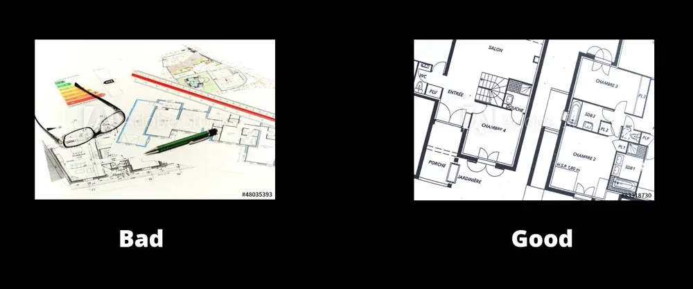
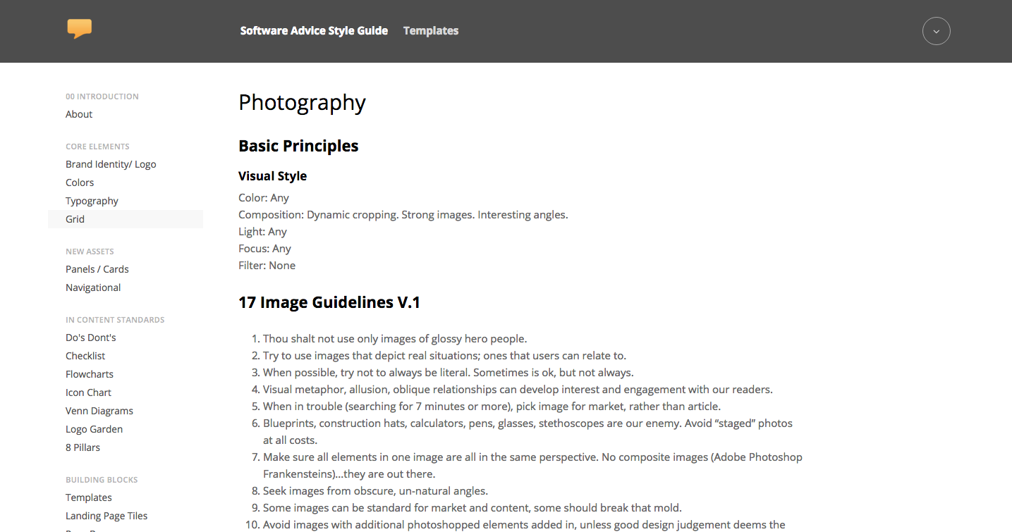
An extensive set of rules were created for how to handle image selection. Photography that was not staged or felt like 'stock photography' was favored. For a more complete list of these rules please see Brand Guidelines at the end of this page.
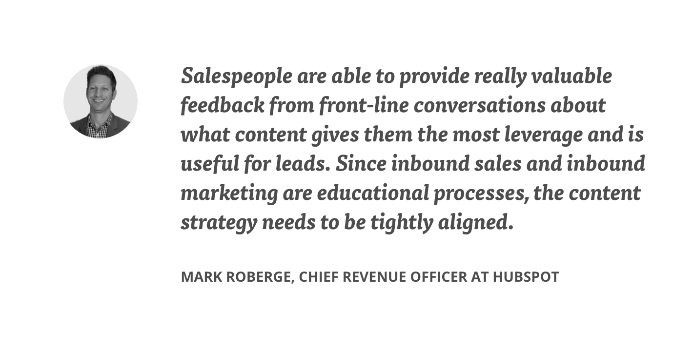
Quote Styles for Responsive Web
All typography on the hub is built to function across multiple platforms. The block quote styles were designed for maximum impact and legibility, and were mocked up for desktop, ipad, mobile browsers in both vertical and horizontal formats.
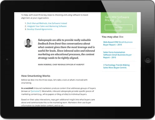
Global Content Templates
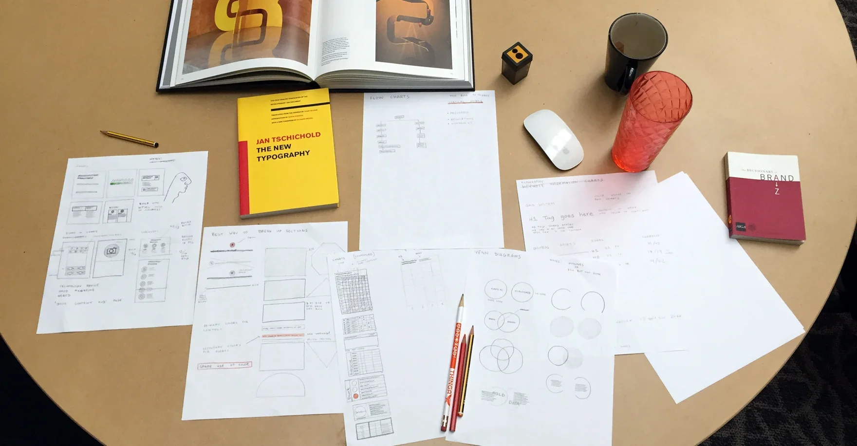
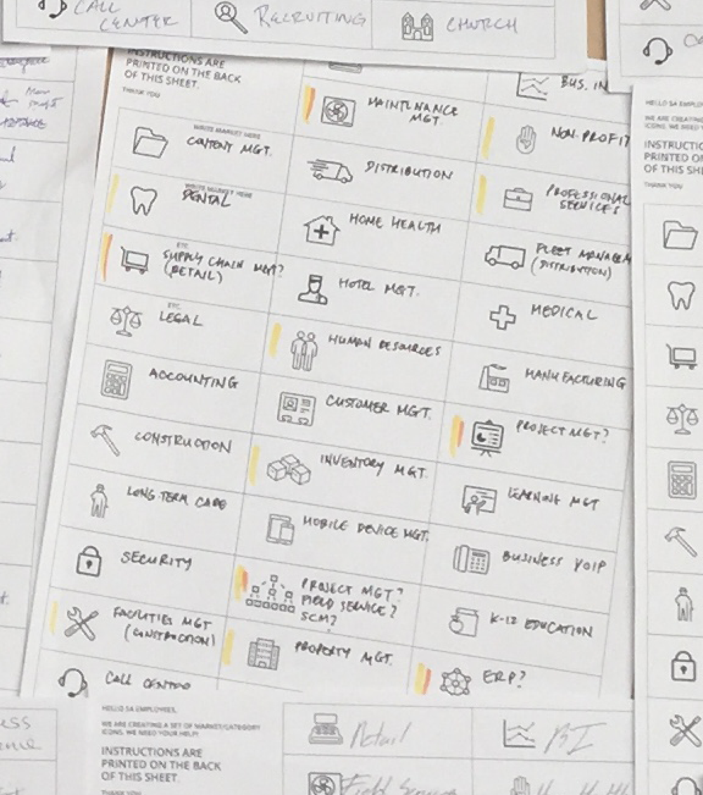
One of the most important projects I worked on was the creation of a set of custom templates that could be used by the Publishing department so that they could produce quality designed content in a scalable manner. The first phase of this project was to create a master system of sketches (seen below).
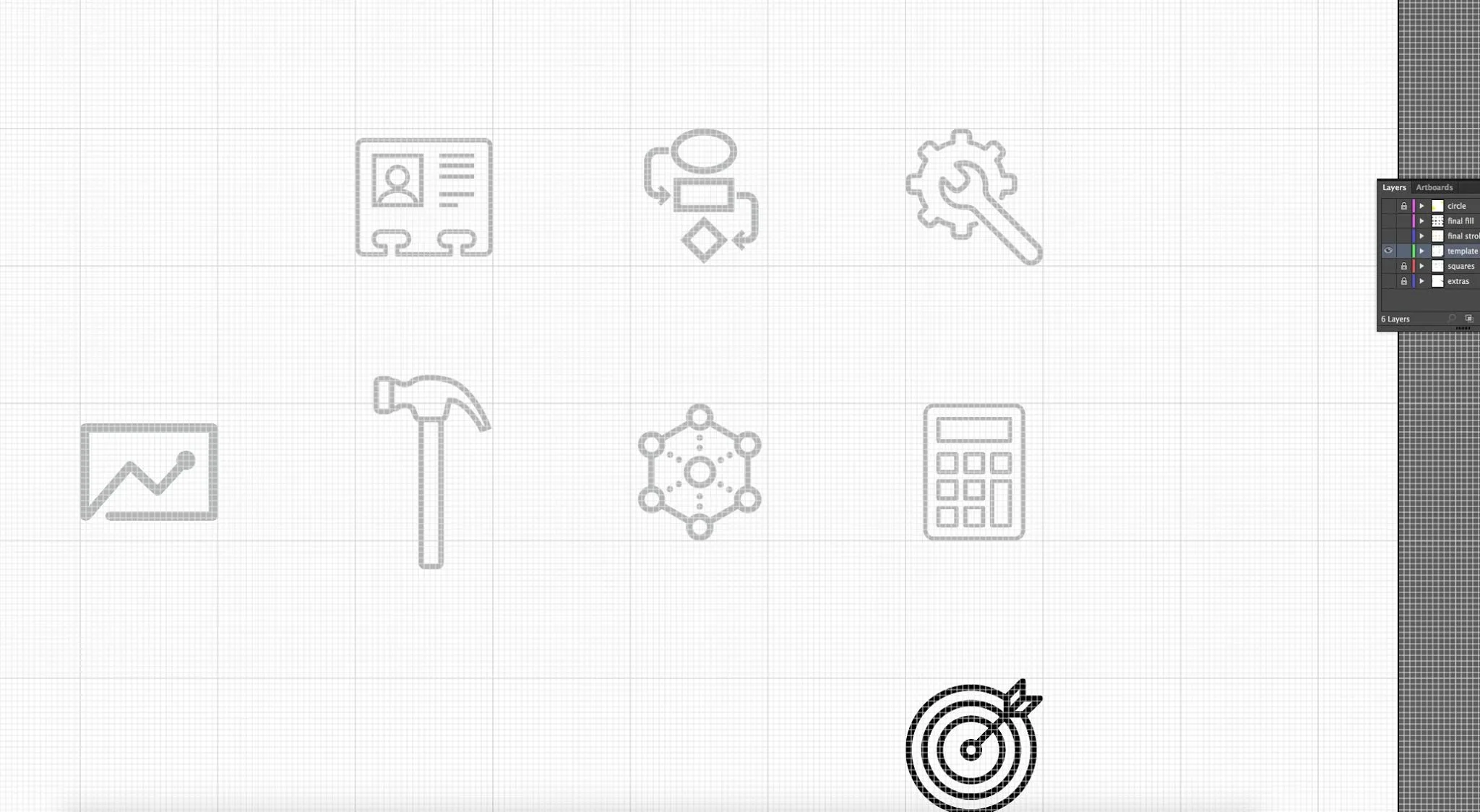
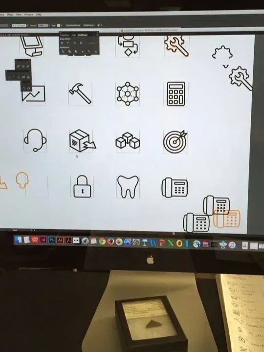
Horizontal Icon Templates
Orbiting Icon Charts
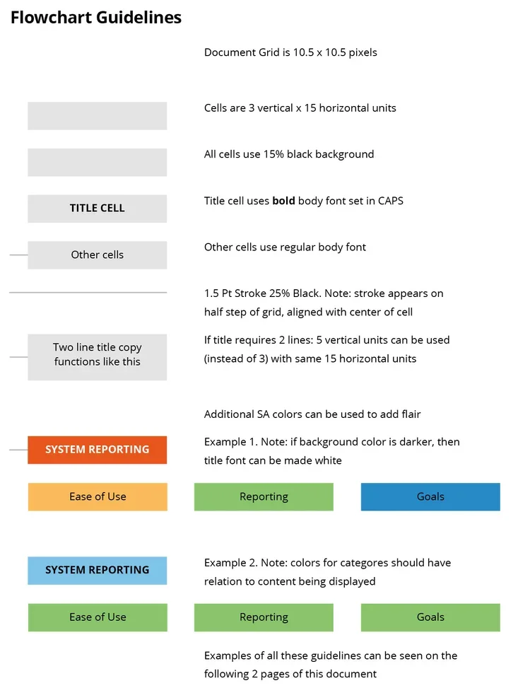
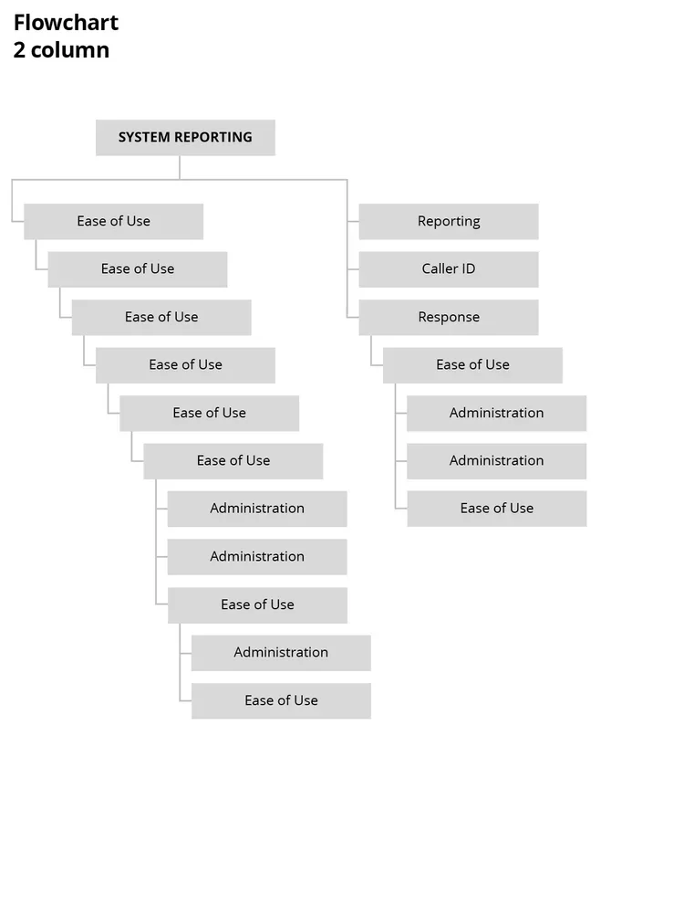
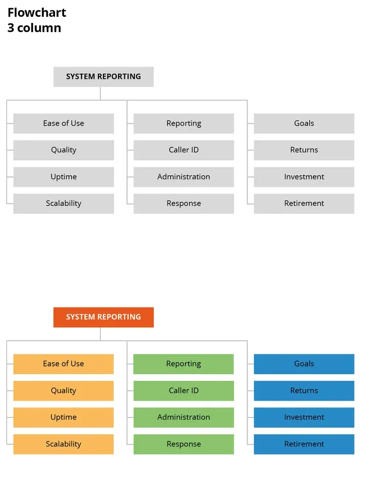
Flowchart
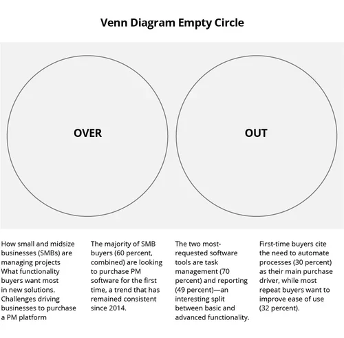
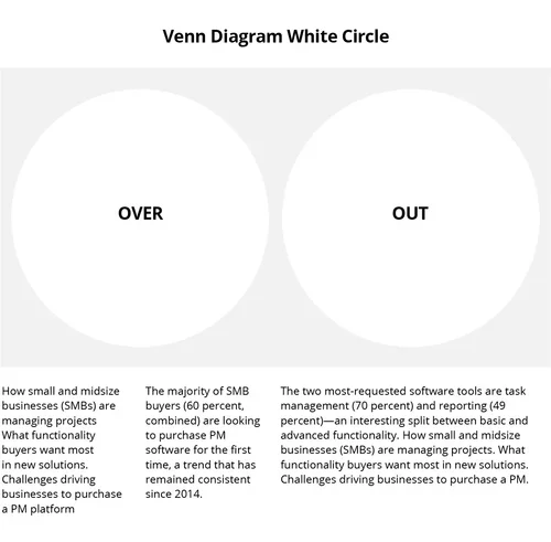
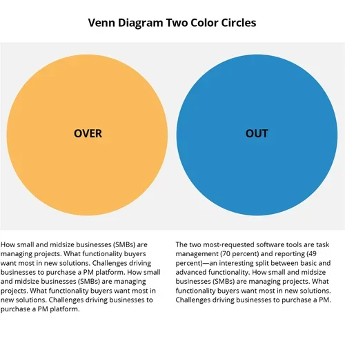
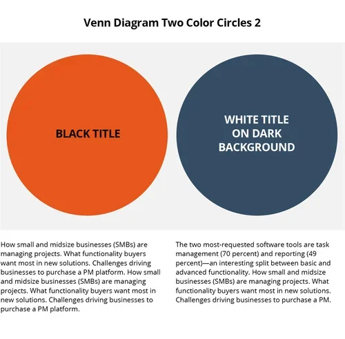
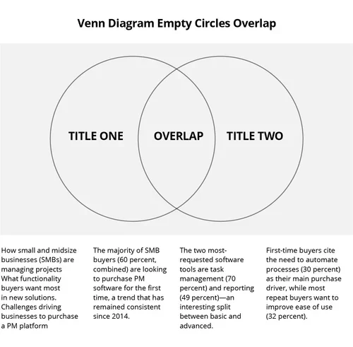
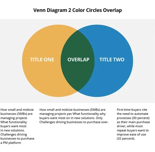
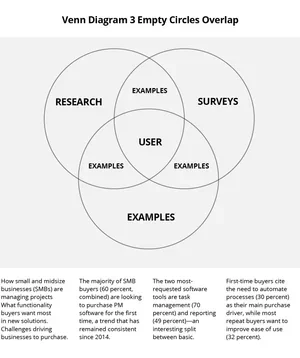
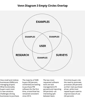
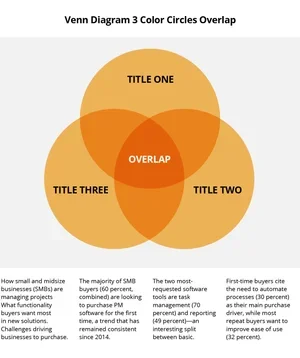
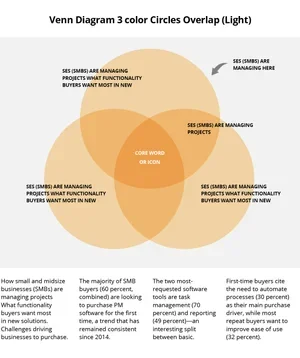
Venn Diagrams
Logo Garden
Customized Icons
A/B Testing
To ensure every mark served its purpose, we approached iconography as a silent language. By blending iconic form with narrative action, we refined these symbols through iterative study and community feedback—stripping away the noise to ensure pure visual comprehension. This process transformed abstract graphics into intuitive bridges, allowing the user to navigate the landscape with effortless clarity.
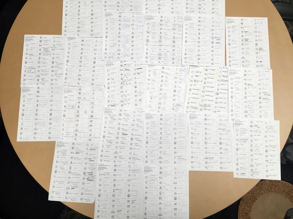
Below are two screenshots of the grid system in place that was used to ensure consistent attributes of all the icons in the set. The same stroke parameters were used in illustrator to be sure that all lines fell on the grid, and that all strokes had the same angles, spacing, and edges.
Infographics

Social Media Assets


Grid System
Branded Color Swatches
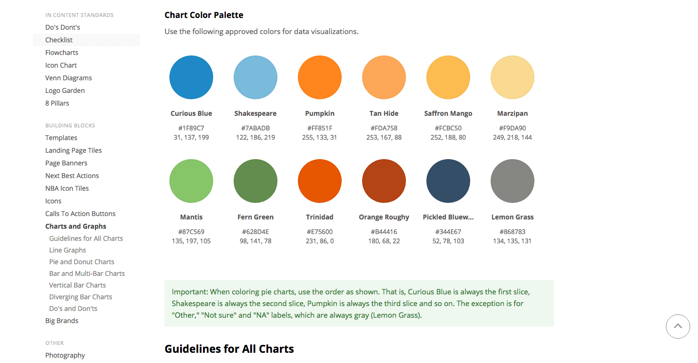
Rules for Imagery
Elevating Authority in the Digital Landscape
Gartner / Software Advice
Overview
Software Advice, a Gartner company, is a premier technology authority that guides software buyers through an expansive landscape of research, reviews, and expert consultations. As a key player within the global Gartner (NYSE: IT) network, the organization reached a pivotal moment where its digital presence needed to evolve from a tactical, link-driven approach to a sophisticated, content-led authority.
Condorita Design
We were brought on for a seven-month strategic residency to lead a comprehensive visual transformation—reimagining how the brand communicates its expertise to a massive global audience and a growing internal team of 165+ professionals.
Our Approach
We directed a full visual evolution, anchoring the brand in a modular, high-altitude aesthetic that balances technical precision with human-centric storytelling to honor the brand authority it deserves.
A Flagship Content Ecosystem
The heart of this transformation was the creation of a new Content Hub. Moving away from fragmented assets, we engineered a cohesive digital environment designed to engage and educate. This wasn't just a redesign; it was a shift in the brand’s soul—turning a data-heavy platform into a vibrant, editorial experience that positions Software Advice as a visionary leader in the SaaS space.
Architectural Clarity & UI/UX
Working in close alignment with leadership and development teams, we established a rigorous design system. From wireframing the user’s journey to defining responsive grid parameters and interactive button states, every detail was meticulously mapped. We transformed complex data landscapes into frictionless paths, ensuring that whether a user is on a desktop or a mobile device, their ascent to finding the right software is effortless.
The Language of Iconography
To support a rapid and scalable content workflow, we developed a custom iconography and art direction system. By blending iconic form with narrative action, we created a "silent language" that guides users intuitively. This visual library was built to be both beautiful and functional—allowing internal teams to scale their publishing efforts without losing the brand’s refined, authoritative edge.
The Impact
Our partnership provided Software Advice with the visual architecture to match its industry stature. The refreshed identity and Content Hub empowered the organization to move beyond simple transactions toward meaningful audience engagement. By bridging the gap between high-level strategy and production-ready execution, we equipped the brand with a scalable, modern expression that resonates within the prestigious Gartner ecosystem.
How We Work
At Condorita Design, we believe that the most powerful brands are those that find clarity at high altitudes. We specialize in taking complex organizational missions and translating them into seamless digital experiences and resonant visual languages. For Software Advice, this meant turning a vast sea of information into a guided journey—providing the wings for their content to reach new heights of influence.